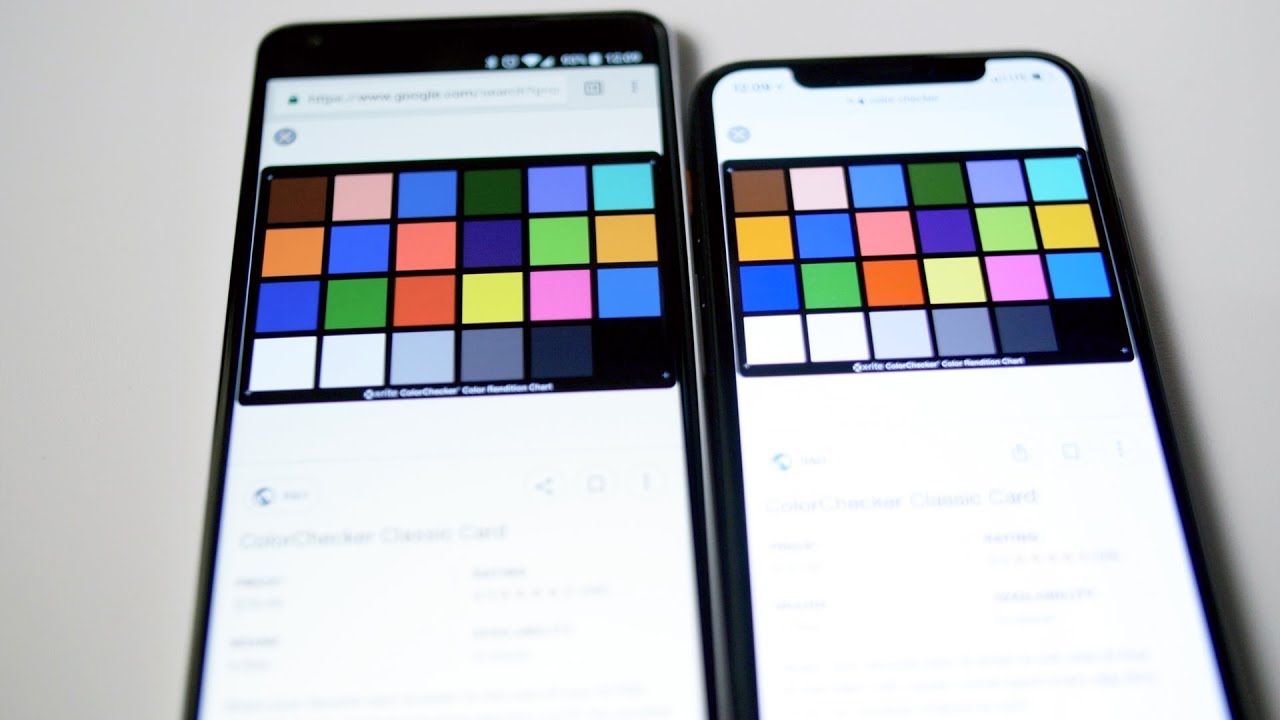
A lot of people complain about the Pixel 2 XL screen quality and for good reason. Out of the box, colors look undersaturated, blacks look crushed, and there’s an off-axis blue shift. This phone costs over $850 and should have a top of the line screen. Samsung makes some of the best OLED displays, but this one uses a screen by LG.
I’ll show you how a two dollar and fifty cent app fixes at least one of those issues.
The Black Crush Issue
The two major issues I had with this screen are the desaturated colors and the black crush. Google resolved the first issue in an update that enabled the “saturated” mode in the settings. Before that update, the only options were natural and boosted. Both had muddy yellows and bland reds.
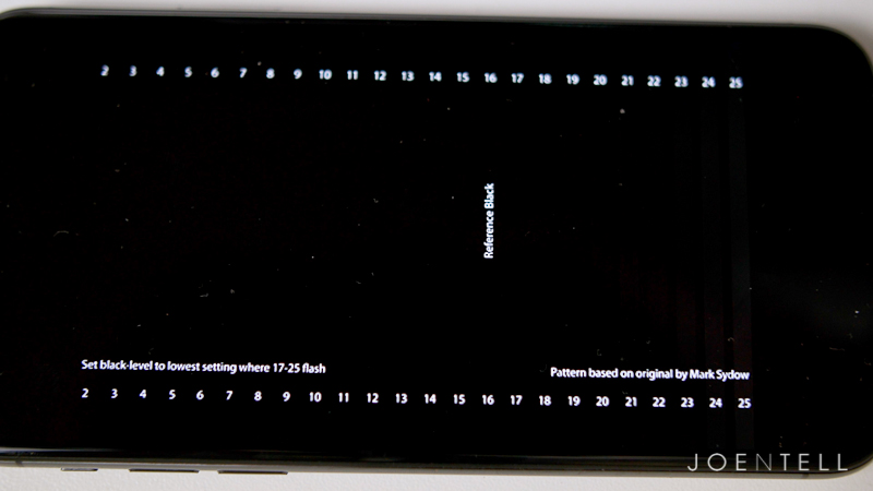
The second issue is with black crush. There are many levels of brightness between absolute black (when all pixels are off) and the brightest white (when all the pixels are on max brightness.) The problem was that some of the darker shades that were not absolute black, were showing up as absolute black. They call this crushing, or clipping and it leads to too much contrast. You won’t see details in shadows that you should be able to see. You want a natural transition between light and dark.
The Fix
Until Google addresses this issue in a future update, the fix is to use an app called Screen Balance. This app allows you to tweak the color temperature, brightness, and contrast. I found out about this app from the YouTuber, This is Tech Today.
Screen Balance is a free app, but if you want it to start on boot-up and also access more advanced settings, you need to pay for the pro version. As of right now, the pro version of the app is $2.50.
What the App Won’t Fix
The app won’t resolve any blue-shift issues or graininess at low brightness. It will fix the black crush issue. It will also allow you to calibrate the white balance to something more pleasing to your eye.
Why I didn’t Use the Recommended Settings
The recommended settings that I found online said to set the white balance to Fluorescent (warm) and strength to 60%. It did eliminate the black crush, but it turned true blacks into a gray shade.
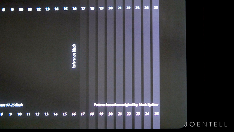
One benefit of using an OLED screen is that it can display true black by completely turning off the pixels. That means when I’m watching a video where black bars show, the bars blend into the black bezels on the phone.
Those settings also made the white balance too warm for my taste.
My Methodology of Calibration
My Settings for Screen Balance App:
– All settings for Color Mode “RGB” on Pro Version
– Calibrations made with night mode off
– To achieve true black levels, set strength to 4% when adaptive brightness is on, 2% when adaptive brightness is off.
My first goal was to reduce the black clipping as much as possible without affecting true blacks.
I used a video on YouTube from the AVS calibration discs. The first test shows different levels of black and dark gray. You should be able to see all the flashing lines up to the reference black level. If you don’t see some of the lines flashing, that means that you have crushed black levels.
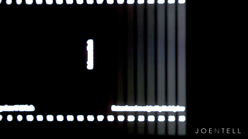
My Settings (Pixel 2 XL Max Saturation & True Black, Adaptive Brightness On)
Red (255)
Blue (255)
Green (255)
Strength (4%)
Contrast (100%)
Brightness (100%)
I found that between 2% and 4% strength were optimal depending on whether I had the adaptive brightness turned on or off. With those settings, I can see all the flashing lines, but at max brightness, the black background still blends into the bezels.
Emulating Different Screens
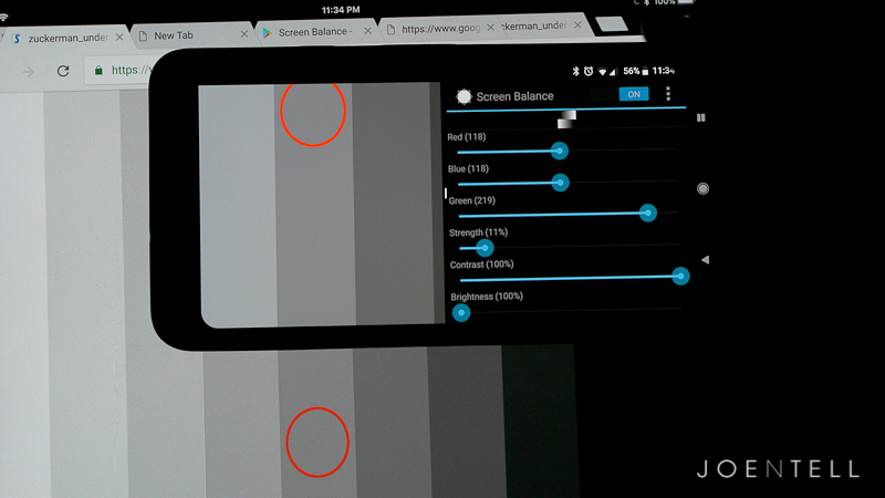 For fun, I wanted to see if I could use this app to emulate some of the screens I had lying around.
Check out the description in my Improve the Pixel 2 XL Screen Quality video for the settings for the iPad Pro and iPhone X
I have a 9.7″ iPad Pro with a Retina IPS display. This is using LCD technology so it cannot display true blacks like an OLED, but Apple’s color calibration has always been excellent.
When using the iPad Pro as my reference screen, I made sure to turn the brightness to max, night shift off, auto-brightness off, and True-Tone off.
I used 18% gray as my white balancing point of reference. 18% gray is also called middle gray and is perceptually halfway between black and white on a lightness scale.
I eyeballed the red, green and blue values, so I’m sure someone else could do a better job if they spent more time or used a calibration spyder. Also, keep in mind that screens can have variations, so what works well on mine, may not be perfect on yours.
Also, note that what the camera sees is different from what my eyes see. In this clip, the grays have a similar color temperature when looking at it in person. On camera, they look way off. It might also have to do with the fact that the Pixel 2 XL screen is OLED and is considerably brighter.
I’ve created one profile that simulates the iPad Pro’s LCD screen, with its lack of true black and all. I also made a profile that achieves true black, but emulates the iPad Pro’s color temperature.
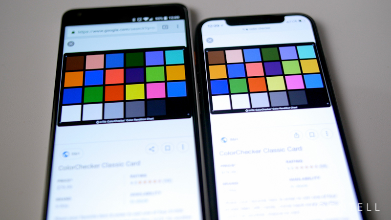
My friend brought his iPhone X, regarded as one of the best screens out right now (yes, it is made by Samsung, but Apple set up the color profile and they did a great job). I prefer their calibration to the oversaturated look of the Samsung phones.
I did my best to match the Pixel 2 XL’s screen to the iPhone X’s and I am happy with how it turned out.
Limitations
There are technical differences between the LG screen and the Samsung screen that causes the differences in the way they render colors. It’s most noticeable in reds and yellows.
There’s only so much that you can do using software tweaks. If the hardware can’t output a certain color at a certain brightness, it just can’t do it.
If you’re willing to root your phone and install a custom kernel, you can use an app called KCal that allows further customization. That’s a big commitment for me though. I want to run my Pixel 2 XL stock for a while. I’m sure I will root and install a custom ROM at some point, but not now.
Conclusion
I’m happy with how my screen on my Pixel 2 XL looks. At no point have I looked at it disappointed by what I see, even when comparing it to my iPad Pro or iMac Retina. It may not be the best screen out there, but it’s still great. We can only hope that Google will come out with a future update with the proper calibration to make the most of this hardware.
Let me know if these tweaks improved your screen. If you have suggestions for other settings, post them in the comments and let us know your method of achieving those settings.
Note: This post contains affiliate links. If you use these links to buy something we may earn a commission at no additional cost to you. Thank you.

